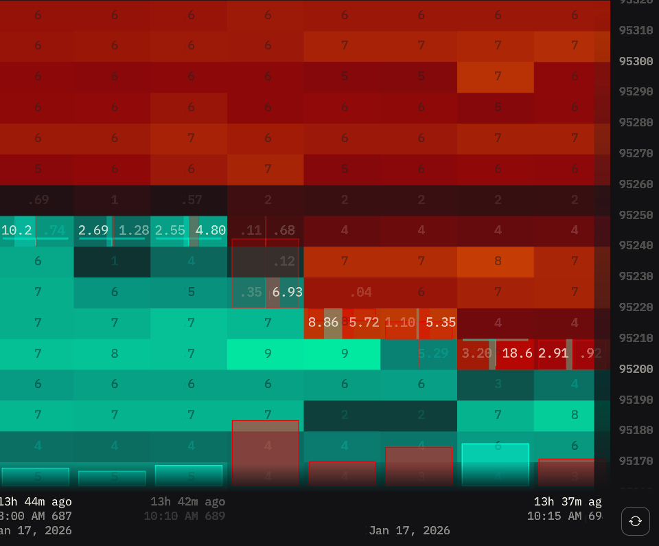
The Orderbook Heatmap widget combines candlestick charts with two layers of market data: a color-coded heatmap showing order book liquidity concentration over time, and footprint volumes displaying executed trades at each price level. This dual visualization reveals both where orders were placed in the order book and where actual trades executed.
The heatmap background shows pending orders from the order book at each price level during specific timeframes, while footprint numbers overlay the candles to display exact executed trade volumes. This combination allows you to analyze order placement patterns, liquidity zones, and actual trading activity simultaneously.

Market Compatibility
The Orderbook Heatmap widget displays one market at a time.
To analyze multiple markets, add multiple Orderbook Heatmap widgets to your board, each configured for a different market.
Interface
Price Chart with Order Flow
The chart combines traditional candlestick price action with a color-coded heatmap showing where orders are concentrated across price and time.
How it works:
Each candlestick represents your chosen timeframe (1m, 5m, 1h, etc.). Behind the candlesticks, the color-coded heatmap visualizes order book depth over time, with color intensity showing liquidity concentration at each price level during that timeframe.
Visual structure:
- Candlesticks - Price movement over time (OHLC bars)
- Heatmap grid - Each cell = order activity at specific price level during that candle’s timeframe
- Accent highlights - Orders exceeding your maximum threshold get special color
- Numbers on zoom - Zoom in close enough and exact order volumes appear on each heatmap cell
Footprints (Volume Numbers)
When you zoom in close enough, numerical values appear directly on candlesticks showing exact trade volumes that executed at each price level.
What you see:
White numbers overlaid on candles displaying the volume that traded at that specific price during that time period.
What footprints reveal:
- Exact volumes - Precise trade size at each price level
- Volume distribution - Where most trading activity occurred within the candle
- Imbalances - Compare volumes at different price levels to spot buying/selling pressure
- Key levels - Largest numbers show where most volume concentrated
Note: Width scaling is relative to what’s currently visible on your screen. Pan or zoom to different price ranges and the scaling adjusts - the largest order in the new view becomes the reference point. This keeps the visualization clear regardless of which part of the chart you’re viewing.
How to read them:
- Large numbers at top of candle - Heavy selling into that price (resistance)
- Large numbers at bottom - Heavy buying at that price (support)
- Cluster of large numbers - High-volume node, significant price acceptance
- Small/missing numbers - Low liquidity, price moved quickly through
Tip: Look for volume spikes at key price levels. If a level shows large footprint volumes repeatedly, that’s a validated support/resistance zone with real trading activity.

Volume Profile Visible Range (VPVR)
A horizontal histogram on the right side of the chart displaying total traded volume at each price level within the visible chart range.
What it shows:
- Long bars (HVN) - High-volume nodes, areas where most trading occurred
- Short bars (LVN) - Low-volume nodes, price levels with minimal trading activity
- POC (Point of Control) - The longest bar, price level with most volume
How to read it:
- HVN zones - Strong support/resistance, price tends to return to high-volume areas
- LVN zones - Weak support/resistance, price moves quickly through these levels
- Gaps - Price levels that traded very little, potential areas for quick moves

Note: VPVR recalculates when you pan or zoom the chart - it always shows volume distribution for the currently visible price range.
Interactions
Chart Navigation
Zooming:
- Hold Ctrl (Windows) or Cmd (Mac)
- Scroll mouse wheel down (zoom in) or up (zoom out)
- Zoom is centered on cursor position
Panning:
- Click and hold anywhere on the chart
- Drag left or right to move through time
- Release to stop
Reset View:
- Click the reset button in the bottom-right corner
- Returns to default zoom level and current price
Tip: Zoom in on specific candles to reveal footprint data. Zoom out to see overall flow patterns and identify key zones.
Chart Scale Adjustment
Adjust price and time granularity to zoom into specific details or see broader patterns.
How to adjust:
Two methods work on both axes:
- Hover over axis → Hold Ctrl (Windows) or Cmd (Mac) + scroll mouse wheel
- Hover over axis → Click and drag
Price axis (right side):
- Drag up / scroll down = finer granularity (more price levels)
- Drag down / scroll up = coarser granularity (fewer price levels)
Time axis (bottom):
- Drag right / scroll up= expand view (more candles visible)
- Drag left / scroll down = compress view (fewer candles visible)
When to adjust:
- Fine price + compressed time: Scalping, precise entry/exit on individual candles
- Coarse price + expanded time: Swing trading, overall market structure and trends
Tip: Day traders often use fine price granularity to spot micro support/resistance levels. Swing traders prefer coarse granularity with expanded time to see major zones and patterns.
Impact on footprints:
Price granularity directly affects which footprint numbers appear on candles:
- Fine granularity - Shows footprints for every price level within the candle
- Coarse granularity - Shows only key price levels to prevent visual clutter
This automatic filtering ensures footprint numbers remain readable regardless of your zoom level.
Note: If you don’t see footprints for specific price levels, increase price granularity by dragging the price axis up or using Ctrl/Cmd + scroll down while hovering over the price axis.
Settings
Heatmap Sensitivity
Dual-slider control for fine-tuning order visibility and highlighting.
Left slider (Minimum threshold):
- Sets the minimum order size to display
- Orders smaller than this value will not be shown on the heatmap
- Use to filter out noise from small retail orders
Right slider (Maximum threshold):
- Sets the threshold for accent color highlighting
- Orders larger than this value are highlighted with special accent color
- Use to immediately spot whale orders and institutional activity
How to adjust:
- Start with default middle positions
- Raise minimum threshold to reduce noise in high-activity markets
- Lower maximum threshold to catch more significant orders
- Adjust based on the specific market’s typical order sizes
Interval
Select the candlestick timeframe for the chart.
How it affects the view:
Each candle represents the selected time period. The heatmap and footprints aggregate order flow data for that interval.
When to use:
- 1 minute: Scalping, high-frequency trading, need second-by-second precision
- 5 minutes: Intraday trading, balance between detail and overview
- 1 hour: Swing trading, longer-term patterns, reduce noise
Tip: Shorter intervals show more granular order flow but can be noisy. Longer intervals reveal clearer trends but miss quick moves. Match the interval to your trading style and holding period.
Align By Last Price
Locks the current price to a fixed vertical position on the chart. As price moves, the chart scrolls vertically to keep the latest candle’s center price at the same spot on your screen.
How it works:
When enabled, the chart automatically adjusts its vertical position so the most recent candle’s center price stays anchored at your viewport position. Price moves up and down, but stays visually locked to the same vertical spot - the chart itself scrolls to maintain this alignment.
When you scroll left to view history or manually pan vertically, auto-alignment temporarily disables to let you explore freely. Scroll back to the right edge to re-enable.
When to use:
- ON: Real-time monitoring - price stays locked to your preferred screen position, chart moves around it
- OFF: Manual control over vertical positioning, analyzing specific price ranges
Show VPVR
Toggle display of Volume Profile Visible Range histogram.
When to use:
- ON: Identify key volume zones, find support/resistance levels based on actual trading activity
- OFF: Cleaner chart view, focus purely on heatmap and footprints without volume profile overlay
Show Trades (Footprints)
Toggle to display footprints (numerical volume values) on price candles when zoomed in.
What it does:
- Shows exact trade volumes at each price level
- Numbers appear on candles when zoomed in sufficiently
- Provides precise volume data for detailed analysis
| Show Trades ON | Show Trades OFF |
|---|---|
|  |
When to use:
- ON: Detailed order flow analysis, looking for exact imbalances
- OFF: Clean chart view, focusing on overall heatmap patterns
Tip: Footprints are essential for scalpers who need to see exact volume distribution within each candle to time entries precisely.
Dim Orders On Zoom
Reduces heatmap color intensity when zoomed in close to view footprints, making the volume numbers easier to read.
How it works:
When you zoom in close enough to see footprint numbers (Show Trades must be enabled), this setting dims the heatmap background colors so the volume numbers stand out more clearly against the cells.
Effect:
- With Show Trades OFF: This setting has no visible effect since footprints aren’t displayed
- With Show Trades ON + zoomed in: Dims heatmap intensity to improve footprint readability
| Dim Orders On Zoom: ON | Dim Orders On Zoom: OFF |
|---|---|
 |  |
When to use:
- ON: Prioritize reading exact footprint volumes, reduce heatmap distraction
- OFF: Keep full heatmap intensity even when zoomed in to footprint level
Dimmed Prices
Dims most price numbers while highlighting key price levels. Makes the heatmap more prominent while maintaining reference points.
How it works:
When enabled, highlights key round-number price levels while dimming intermediate ones. The specific levels highlighted remain consistent regardless of your price axis zoom - whether you’re zoomed in with fine granularity (more levels visible) or zoomed out with coarse granularity (fewer levels visible), the same major price points stay bright for orientation.
| Dimmed Prices ON | Dimmed Prices OFF |
|---|---|
 |  |
When to use:
- ON: Focus on heatmap visualization while keeping key price levels visible for orientation
- OFF: All prices equally readable, better for precise order placement and detailed price analysis
Max FPS
Limits screen refresh rate. Higher FPS = smoother updates but more CPU usage.
Note: FPS only affects visual updates. All market data is captured regardless of FPS setting.