A footprint chart is a candlestick chart that shows the exact volume of buy and sell orders that executed at every price level within each candle. Instead of seeing only open, high, low, and close — you see where buyers and sellers actually traded, and in what quantities.
This makes footprint charts one of the most precise tools for order flow analysis: you stop guessing where support and resistance are, and start reading the actual market activity that created them.
What Is a Footprint Chart?
A footprint chart replaces the hollow body of a standard candlestick with a grid of bid/ask volumes. Each row in the grid corresponds to a specific price level. Each cell shows how many contracts or coins traded at that price — split by side: buy volume on the left, sell volume on the right.
| Show Trades ON | Show Trades OFF |
|---|---|
 |  |
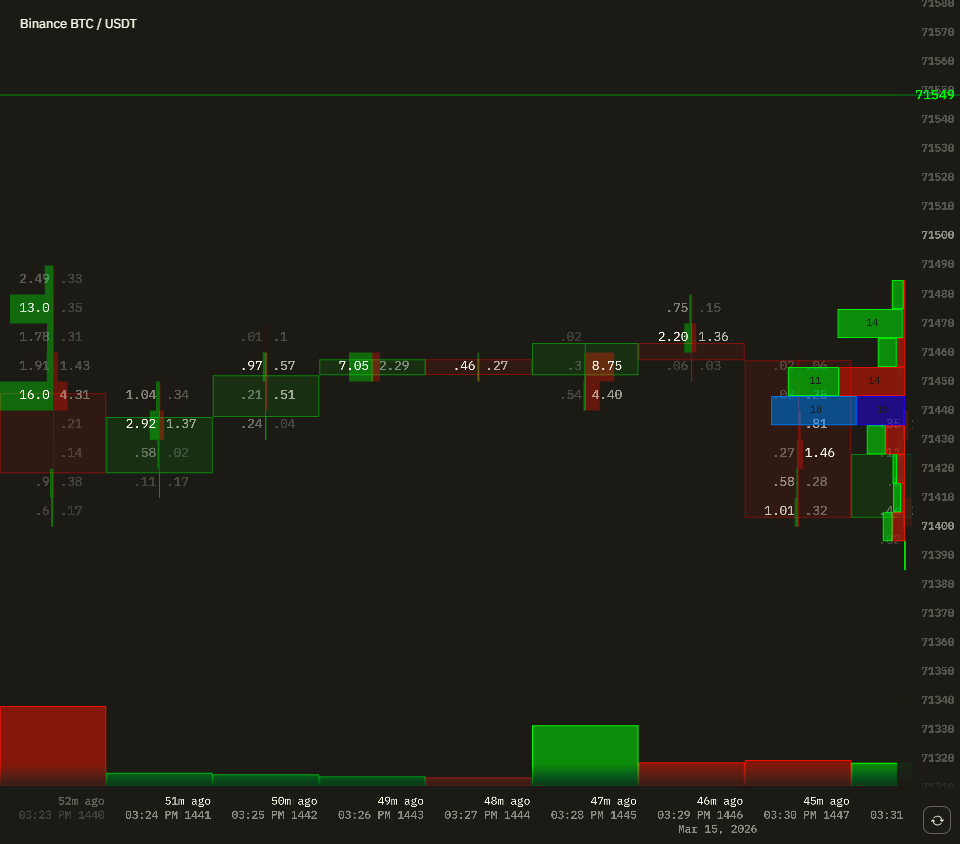
Both views show the same BTC market, same timeframe. On the left, each candle body is filled with a grid of numbers — buy volume on the left side of each row, sell volume on the right. On the right, those numbers are hidden and you see plain candlesticks.
Take the green candle at 11:21 PM. Standard view: price recovered from ~89150 back up to ~89190. Footprint view: at 89180, 0.03 BTC bought vs 0.02 sold — roughly even. At 89170, 1.78 bought vs 0.82 sold — buyers taking control. At 89160, 0.64 bought vs 0.02 sold. But the key level is at the bottom: 89150, where 22.6 BTC bought vs just 0.34 sold. A large passive buyer was sitting at that level absorbing all the aggressive selling from the previous candle. The moment the selling pressure exhausted, the bid took control and price snapped back. That single price level explains the entire reversal — invisible on a standard chart, obvious on a footprint.
The standard candlestick tells you the result. The footprint tells you how it happened.
How to Read a Footprint Chart
Sell and Buy Columns
Each price level in a footprint candle shows two numbers with horizontal bars indicating relative size:
- Left side (buy) — buy-initiated volume at this price (market buy orders lifting the ask)
- Right side (sell) — sell-initiated volume at this price (market sell orders hitting the bid)
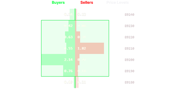
When buy volume dominates a price level, buyers were more aggressive there. When sell volume dominates, sellers were more aggressive. The footprint makes this visible at every price within every candle — something a standard candlestick hides entirely.
Delta
Delta is the difference between aggressive buying and aggressive selling at each price level — buy volume minus sell volume at that specific price:
Level delta = Buy Volume at price − Sell Volume at price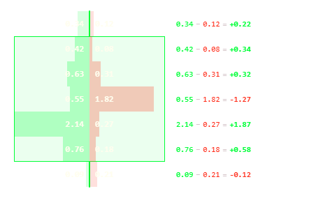
A positive level delta means buyers were more aggressive at that price. A negative level delta means sellers were more aggressive. The candle delta is the sum of all level deltas within the candle — it tells you the net aggression across the entire move.
- Positive candle delta — aggressive buyers dominated across the candle
- Negative candle delta — aggressive sellers dominated across the candle
Important: Delta doesn’t predict direction on its own. A candle with strong negative delta (heavy selling) can still close higher if sellers were absorbed by large passive buy orders sitting in the order book. This is what makes footprint analysis powerful — you see who was aggressive at each price level, and whether that aggression actually moved price or got absorbed.
Imbalances
An imbalance occurs when the volume on one side at a price level dramatically exceeds the opposite side at the adjacent price level — typically 3× or more. In TapeSurf, each price level is colored by the relative bid/ask volume — the stronger the imbalance, the more intense the color.
Buy imbalance — buy volume at one level far exceeds sell volume at the level above it:
- Aggressive buyers overwhelmed available sellers
- Often signals strong upward pressure
- Price tends to return to fill these levels
Sell imbalance — sell volume at one level far exceeds buy volume at the level below it:
- Aggressive sellers overwhelmed available buyers
- Signals strong downward pressure
- Often acts as resistance on retests
Stacked imbalances — multiple imbalances in a row on the same side — are one of the strongest footprint signals. They show a directional auction with minimal resistance on one side.
Footprint Chart vs Regular Candlestick
| Candlestick | Footprint Chart | |
|---|---|---|
| Price action (OHLC) | ✅ | ✅ |
| Total volume | ✅ with volume bars | ✅ per price level |
| Buy/sell split | ❌ | ✅ |
| Volume at each price level | ❌ | ✅ |
| Imbalances | ❌ | ✅ |
| Delta per candle | ❌ | ✅ |
| Reading difficulty | Low | Medium–High |
Candlestick charts show what price did. Footprint charts show how it happened — which matters when you need to understand whether a move was driven by aggressive buyers, exhausted sellers, or absorbed liquidity.
Footprint Chart vs Depth of Market (DOM)
Depth of Market shows the current limit order book — pending orders waiting to execute. Footprint charts show historical executed trades — what already happened at each price.
They answer different questions:
- DOM / Order Book: Where are orders sitting right now? What is the current liquidity wall?
- Footprint: Where did trades actually execute? Who was the aggressor?
Traders use both together: the order book to see current structure, footprints to see how previous moves were built and whether similar dynamics are repeating.
Key Patterns to Look For
Stacked Imbalances
Multiple consecutive imbalances on the same side within one candle or across several candles in a row. When buyers are consistently overwhelming sellers at every price level as price rises, that confirms genuine directional pressure.
Stacked buy imbalances during an upswing confirm real buying. Stacked sell imbalances during a downturn confirm real selling. When imbalances run out — the move often exhausts.
Absorption
Absorption occurs when one side places large passive orders that absorb the opposite aggressive flow without price moving much.
Example: Aggressive sellers push into a level with heavy sell volume in the footprint, but the candle barely moves down. That means large passive buyers were sitting at those prices, absorbing every sell. Absorption at a key level often precedes reversals.
Delta Divergence
A candle closes higher, but delta is negative (more selling than buying throughout the candle). This divergence suggests the upward move was driven by passive buyers in the order book, not by aggressive buyers lifting the ask. It can signal exhaustion.
The reverse: candle closes lower with positive delta — price dropped despite aggressive buying, meaning large passive sell walls absorbed everything. Potential reversal zone.
High-Volume Nodes
Price levels where large volumes executed within a candle. These act as magnets — price often returns to test them. In crypto, high-volume nodes on BTC frequently cluster around round numbers where institutional orders concentrate.
Low-Volume Gaps (Poor Highs/Lows)
If price moves quickly through certain levels with very little footprint volume, those levels have weak acceptance. Markets tend to revisit them to complete the auction — providing potential entry zones on retests.
Footprint Chart Trading Strategies
Strategy 1: Stacked Imbalance Continuation
Setup: Identify a trend. Wait for a pullback. Look for stacked imbalances forming in the trend direction as price resumes.
Entry: When imbalances stack in the original trend direction Stop: Below the imbalance zone Target: Previous swing high/low or next high-volume node
Why it works: You’re not trading a price pattern — you’re trading demonstrated buying or selling pressure confirmed by real volume.
Strategy 2: Absorption Reversal
Setup: Price approaching a key level — support, resistance, or a round number.
Look for: Heavy aggressive selling into a level but candles not moving lower (or heavy buying with candles not moving higher). The footprint shows large sell volume on the right side, but price holding.
Entry: After 2–3 candles of clear absorption at the level, when delta reverses Stop: Beyond the absorption zone Target: Back to the origin of the aggressive move
Why it works: Large passive orders absorb the aggression. When the aggressive side exhausts, the passive side takes control.
Strategy 3: Unfinished Auction
Setup: Price made a fast move leaving a clear low-volume area in the footprint — price ran through those levels with minimal trading on either side.
Entry: When price returns to test the low-volume zone Stop: If price breaks through the zone with strong delta in that direction Target: The high-volume node that formed before the gap
Why it works: Markets are auction mechanisms. Imbalanced moves tend to get revisited for price discovery. The footprint shows you exactly where those imbalances exist.
Footprint Charts in Crypto
Crypto markets have characteristics that make footprint analysis particularly valuable:
24/7 continuous trading — No overnight gaps. Footprint patterns build and resolve in real time without session breaks affecting the data.
Liquidation cascades — Crypto’s leverage creates rapid liquidation events that show up as sudden imbalances — massive sell volume hitting in a single candle as long positions get forcibly closed. Recognizing liquidation-driven selling versus organic selling helps avoid entering on false breakdowns.
Perpetual futures — Crypto perps trade at a premium or discount to spot based on funding rates. Footprint charts on perps capture when large players are rolling or unwinding positions, creating distinctive absorption patterns that precede larger moves.
How to Use Footprint Charts on TapeSurf
TapeSurf’s Order Book Heatmap widget combines footprint analysis with order book depth data on a single chart:
- Open TapeSurf and add the Order Book Heatmap widget to your board
- Select a market — BTC/USDT on Binance, or any of 10,000+ available markets
- Zoom in on individual candles to reveal footprint numbers at each price level — buy volume appears on the left side, sell volume on the right
- Zoom in vertically to expand price levels — when space is limited, levels compress automatically to keep the view clean
- Use the VPVR (Volume Profile Visible Range) alongside footprints to identify high-volume nodes across the visible range
Footprint data for major markets (BTC, ETH, SOL) is available on the free plan. Pro plan unlocks all 10,000+ markets and extended historical footprint data.
Frequently Asked Questions
What does a footprint chart show?
A footprint chart shows the volume of buy and sell orders that executed at every price level within each candlestick. Unlike standard candles that show only price movement, footprints show who was aggressive — buyers or sellers — and where most trading activity occurred within each candle.
How is a footprint chart different from a volume profile?
Volume profile shows cumulative volume across a time range — it answers “how much volume traded at this price overall?” Footprint charts show volume within individual candles — they answer “how much bought vs. sold at each price during this specific 5-minute period?” Volume profile shows historical zones; footprints show the real-time mechanics of each individual candle.
Is a footprint chart free on TapeSurf?
Yes. TapeSurf provides free footprint chart data for major crypto markets including BTC/USDT, ETH/USDT, and SOL/USDT. No account required to view. A free account unlocks the full dashboard. Pro plan unlocks all 10,000+ markets and extended historical footprint data.
What is delta in a footprint chart?
Delta is the difference between aggressive buy and sell volume at each individual price level (Buy − Sell at that price). A positive level delta means buyers were more aggressive there; negative means sellers were. The candle delta is the sum of all level deltas — it shows net aggression across the whole candle. Delta divergence — price moves up but candle delta is negative, or price drops but delta is positive — signals that the move was driven by passive liquidity absorbing aggression, not by the aggressive side pushing price.
How do you read imbalances on a footprint chart?
An imbalance occurs when the volume on one side at a price level is significantly larger (typically 3× or more) than the opposite side at the adjacent level. Buy imbalances show aggressive buyers overwhelmed sellers. Sell imbalances show aggressive sellers overwhelmed buyers. Multiple stacked imbalances in the same direction within one candle are one of the strongest footprint signals.
What timeframe works best for footprint charts?
For scalping: 1-minute or 5-minute footprints provide granular order flow detail. For day trading: 15-minute or 1-hour footprints show cleaner structure with less noise. For swing trading: 4-hour or daily footprints identify major institutional zones. Most traders use a higher timeframe to identify key zones and a lower timeframe to time entries within those zones.